 Project
:
Knox typography
Project
Knox typography

Contribution
Tools & skills
Info+
Want to design for multi-line use cases quickly by having existing typography standards.
Want to develop the design without using custom typography styles to eliminate excess maintenance.
The current and sole typography style was suited for one-liners—such as tables, buttons, list items—because it had a tight line height which would not have additional bottom padding. Those elements used to be the majority content in 1Password’s products. However, as 1Password expanded into uncharted territory, such as Extended Access Management (XAM) and AI, the product needs changed, which means the design system had to take a look at itself as well.
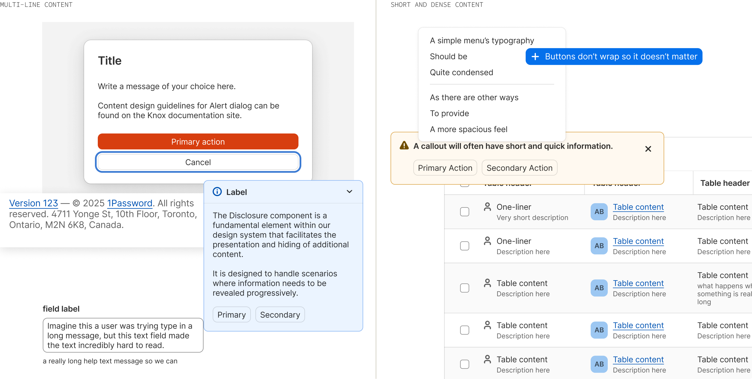
The ask from our users was that the default line height was too tight and they would like the default to be larger. Largely, designers were detaching typography styles then arbitrarily deciding a larger line height for their specific work. This was extra unnecessary effort.
The current Knox line height was set to normal; which meant it was defaulting to whatever browser or platform default it was, typically 120%. This was a problem to be address later, as this would involve developer expenditure to figure out the iOS and Android considerations, which we did not have capacity for.
The reason the line height was so tight to begin with was because of two main reasons:
Designers asked for this new line height as more features were being built out and they were noticing odd spacing when there was more than one line, especially when there was decorative elements involved. These new features involved end users learning new processes and some having destructive or warning actions, often having text-heavy content, making it easy for end users to be overwhelmed by high information density. Having a looser line height would be easy and subtle but impactful way mitigate high information density.
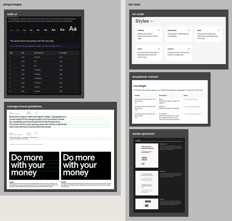
I looked into other design systems with an elaborate typography system to understand how they handle the variety of typography needs.
Due to the variety of typography needs from designers, it is impossible to accommodate for all needs. A design system should typically design for the lowest common denominator, which is why Radix UI and Cash App do not have set typography styles, but rather offer a value ramp or suggestion for designers to choose from.
On the other hand and more similarly to Knox, Adobe Spectrum, REI Cedar, and Docplanner Watson have set typography styles. 1Password has yet to expand into markets that use non-Latin scripts, so Adobe Spectrum was just an interesting case study. Docplanner Watson and REI Cedar set up their typography to have 2 separate typography styles, one for tighter content and one for spacious content.
This also informed me on whether or not we needed a larger revamp of the typography system. As the updated typography would support majority of user needs and with some other design explorations in flight, I decided that a full revamp was unnecessary.

Informed by internal audits, user research, and external research, I began my visual explorations. I pulled common components and layouts that involved 2 or more lines or sentences.
I did various explorations of different line height sizes—standalone and in contrast with our current line height. From 130% to 170%, I did it all. After a round of feedback, I was asked to make in between sizes, such as 145% and 162.5%. I landed with 2 competing sizes: 150% and 165%.
Although the larger line height at 165% looked wonderful in multi-line paragraphs, it was not the most common use case. Furthermore, I had to consider existing Knox font sizes were 12px, 14px, and 16px, which, using 165% would result in respective line heights of 19.8px, 23.1px, and 26.4px. In comparison, 150% worked better for the 1Password—1-2 lines. Additionally, a 150% line height result in 18px, 21px, and 24px, which were nicer round values.
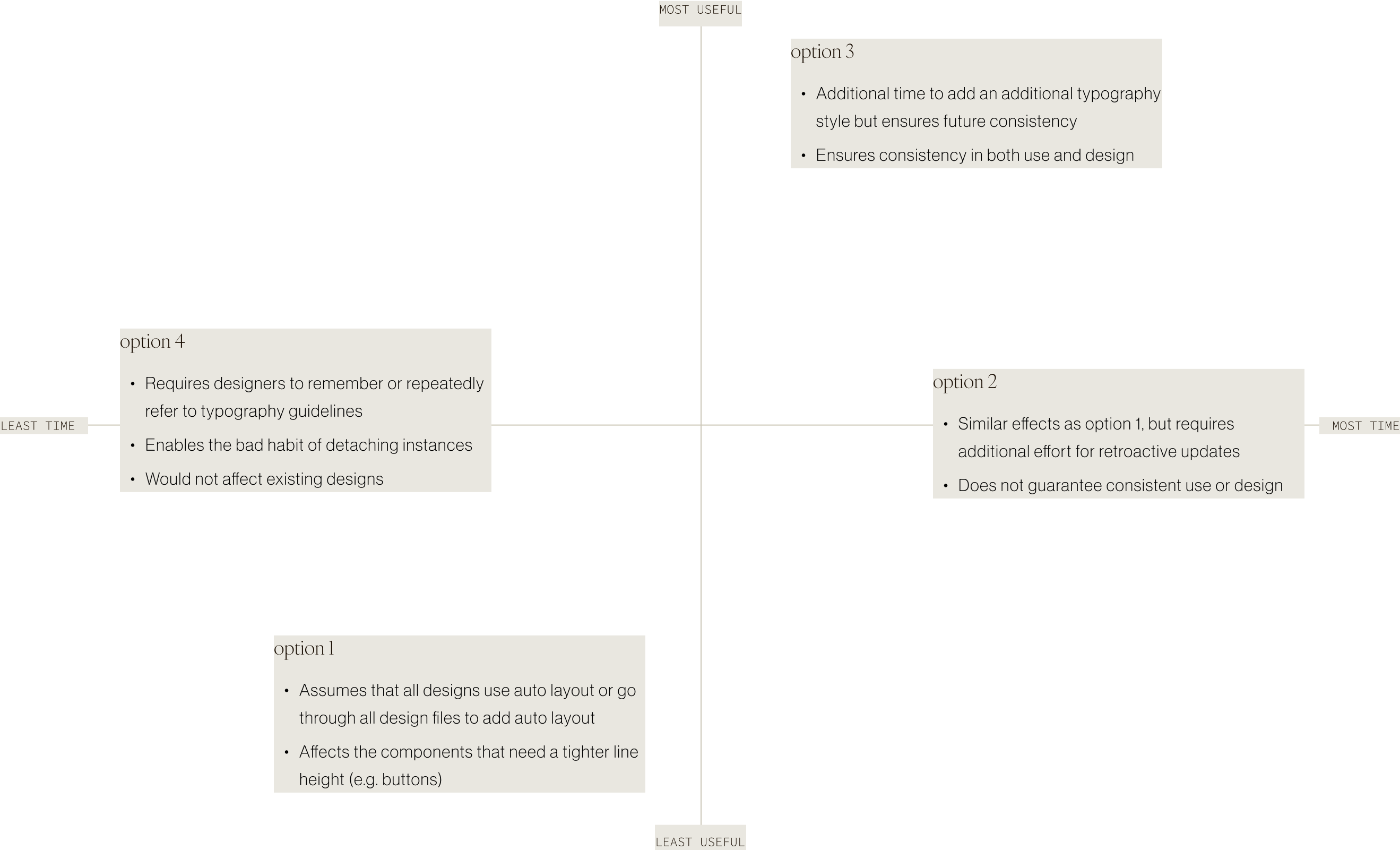
Implementation was in the back of my mind during these explorations. In both Figma and development, there were 4 options of implementation and some immediate pros and cons that came to mind:
Change the current typography to use 150% line height and not retroactively update all UIs.
Change the current typography to use the 150% line height and retroactively update all UIs to use 120% line height.
Keep the current typography that uses 120% line height and add in new typography styles that use the 150% line height
Introduce in the line height size but not as a style.
After a good amount of systems thinking and discussing with designers and developers, I landed on option 3: keeping the current typography and incorporate new typography styles. The effort to add an additional typography style would be rewarded in designers being able to design more efficiently. In the graph below, I would add an additional dimension, which is future reward—though option 4 would take the least time, it would not be a long-lasting option as soon designers would likely request it to be a formal typography style or designers would build a habit of detaching instances and thus breaking design standards.
An additional consideration was naming: "paragraph", "comfortable", "large", "reading", "natural", "long-form" were all options. We landed on "paragraph" as it most accurately described the purpose of this new typography style.
Organization-wise, it was important to consider how designers would most easily and effective find and use the new typography style. In Figma, there were also many different methods of organization. There’s so many to list, that I will just tell you the outcome.
After speaking to a few designers, they said that they usually know what size they are looking for, but they do not have the copy until later in their design process. Thus, I kept the existing structure and added a new folder for the paragraph typography style, allowing designers to find the size first, then choose the density later.
As part of my interests, I decided to pursue implementing the base tokens and the alias tokens myself. I will not bore you with the specifics, but this is what I did for Web (TypeScript), iOS (Apple), and Android (Kotlin):
It was very cool : )
This being one of my first un-scoped projects, it was a great opportunity for learning and mentorship.
The greatest joy of being a design system designer is being able to support all designers in their processes and work. However, this means that you will not be able to design for every specific use case, but rather a common use scenario that most designers encounter. When edge cases do arise, advise designers to communicate with the design system team so that we can reassess the current system and/or offer solutions.
Whether it be talking to others or looking at existing products, referencing resources will always be immensely helpful. Consulting other design system designers for their thoughts and insights massively sped up this process (especially given that this was my first un-scoped process). Finding the typography structure in other design systems using component.gallery and designsystem.surf was a great influence on my decisions. Asking developers for their expertise also informed me on the most effective and efficient way of presenting this new resource to designers and developers.