
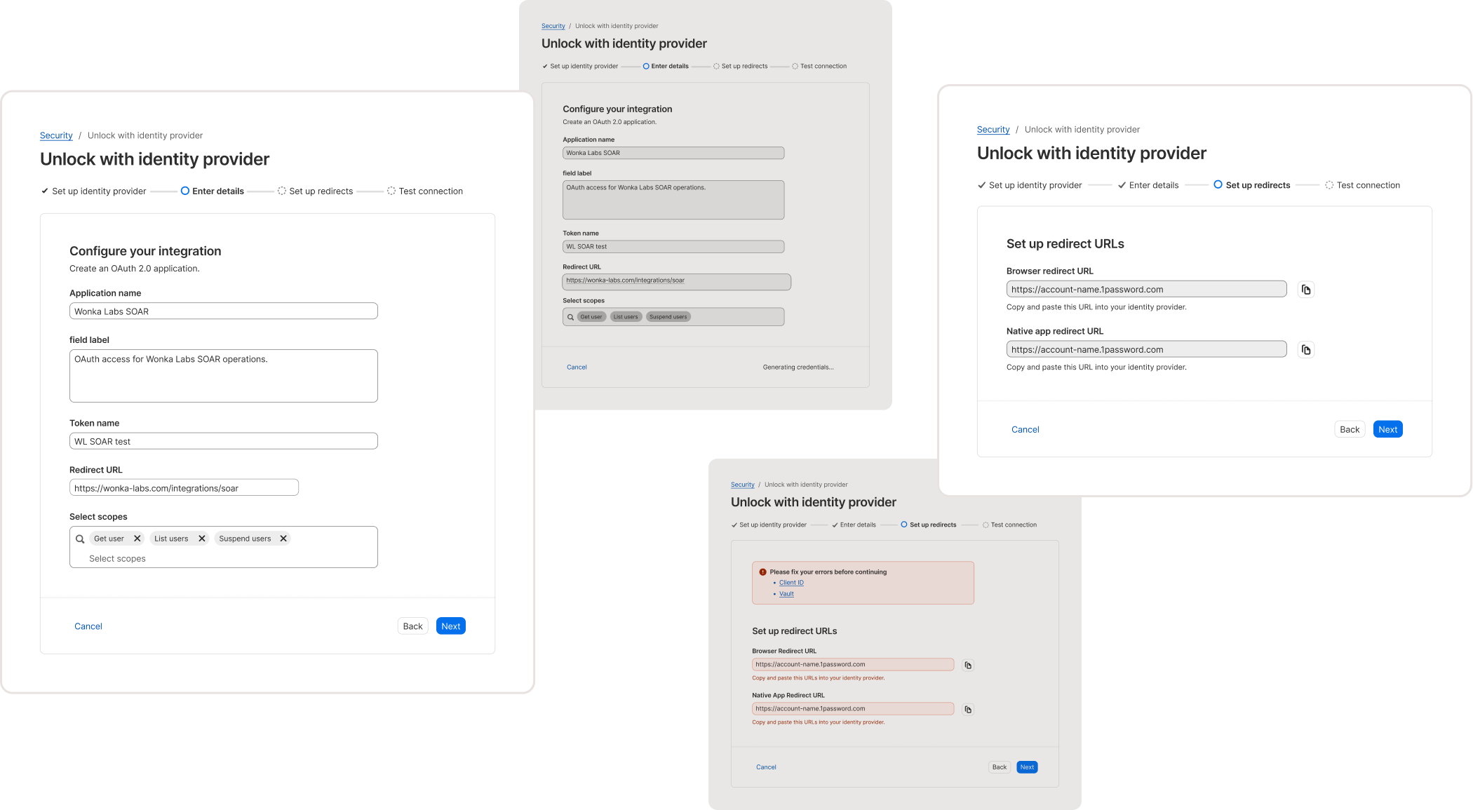
Sometimes you just need a little magic: the Wizard of Knox, a multi-step form with a step tracker.
Contribution
- Wizard pattern
- Pattern guidance
- Wizard components
Info+
- 1Password
- Design system (Knox) team
- 4 weeks
Tools
- Figma
- Notion
- Typescript
Soft skills
- System thinking
- User research
- User testing
Defining the problem
I, as a Knox user,
Have trouble configuring a multi-step form for our users and have to spend excessive thinking critically about how to organize the form when I start designing.
I, as a 1Password customer,
Want to complete a task that requires a lot of steps and it is overwhelming when it is all listed at once.
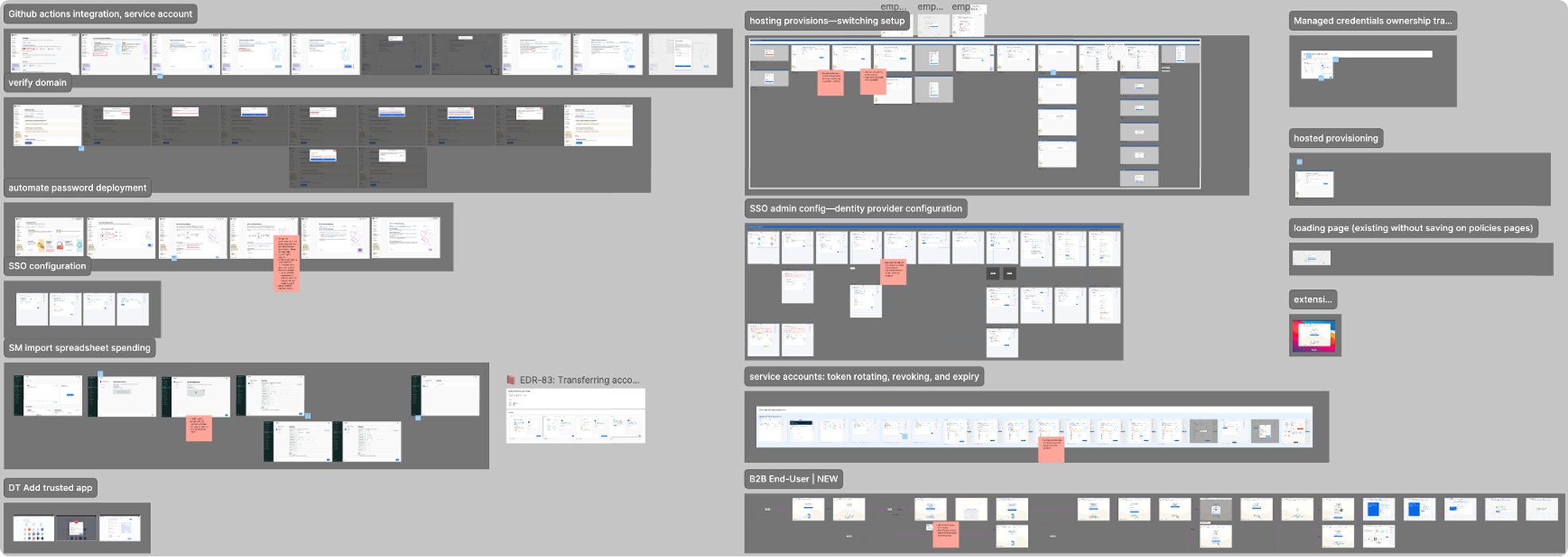
Wizards were most commonly used for set up, ranging from specific feature set ups to general onboarding.
In order to understand the wizards use cases throughout 1Password products, I had to understand the general form use cases throughout 1Password products as well. I conducted an audit for both regular forms and wizards, across all of 1Password products, include the Extended Password Manager, the SaaS Manager, Device Trust, and the consumer apps.
I found that Wizards were most commonly used for set up, ranging from specific feature set ups to general onboarding.
Thus, the goal was to create a repeatable pattern that guides users with a through a large task with multiple steps and external actions in a digestible way.
I found that very few public design systems had wizard guidance.
If they did, they were very abstract or high-level. Knox wanted a more in-depth pattern for our designers, so I took a lot of influence for UX research.
I learned that wizards should not be used as tutorials or to teach users on how to interact with certain features. This was an insight that informed the development of the Coachmark component and the Feature discovery pattern. This insight also reminded me of a UX note in game design, where if a game needs a tutorial, it might not be a good game or it might not be intuitive.
Another decision was to guide users to not put Wizards in modals as modals are best for focused, singular actions, while wizards are often complex, multi-step tasks. Additionally, putting wizards in modals might introduce bad design decisions such as a modal on modal when a user tries to exit a wizard.
Designing
“As a 1Password user, I want to know what page I am on and then know what I’m specifically looking at”.
To frame the wizard in my mind, I separated the content of a page with wizard into 2 parts: Page-level information and form-specific information. Since the wizard is basically a new form on every page, hierarchical emphasis should be on the wizard, while the page-level information would be become a static, repeating block that users could ignore over each page.
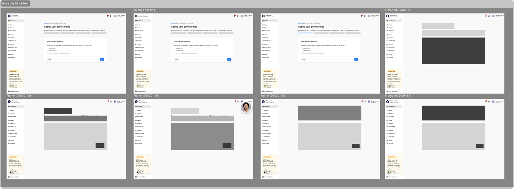
As I did more iteration, it become clear that in addition to separating the page-level and form- specific information, there should also between a separate between the two, which introduced the Step tracker component.
The final hierarchical balance looked more like this:
- Wizard
- Step tracker
- Page header
Define and design the new Step tracker component.
Previously, this project was derailed by months due to the step tracker being a difficult component to design for and due to an overwhelming amount of differing feedback.
This time around, I defined the purpose of the Step tracker in the Wizard in order for us to determine the Step tracker’s design, which also allowed others giving feedback to know what to look for:
- Help users keep track of steps (current, inactive/incomplete, completed)
- Be secondary to the form content (not draw too much attention)
- Act as a divider between the high-level info and the page-specific info
After determining the lay out, I handed off the component to an intern as an opportunity to mentor and help them learn. During this process, I guided the intern on how to make design decisions and provided my insights on how to present for feedback. This allowed the intern to quickly complete the project.
Using the system to solve systematic issues: Enforcing an action in a wizard.
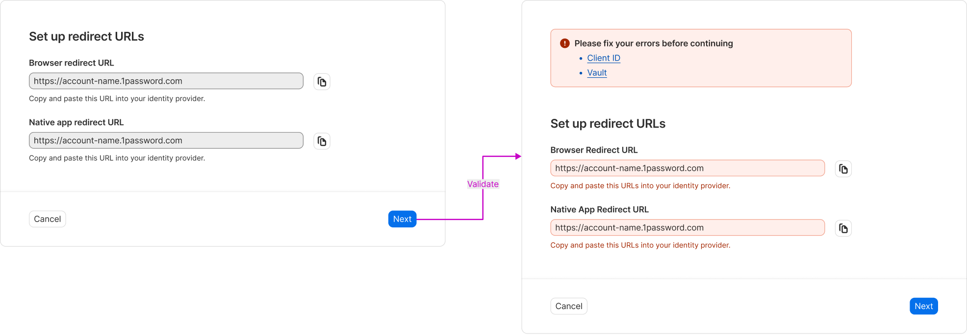
Each wizard was consistently encountering the problem of enforcing a mandatory action that the user had to take. Designers found various creative ways to ensure users would perform action, from boxing users into a modal dialog, disabling the progressing button, or using warnings.
Through iterating and critique, I concluded that the best and most simple way to enforce an action was to rely on the existing Knox form component validation capabilities. If the input was wrong or missing, the Form within the Wizard would error, where the input would have its own error text and a callout with deep links to the errored input(s) at the start of the form would show which inputs needed to be fixed before continuing. This was the most simple and effective way to enforce an action.
Systems thinking
Designing systematically, not for exclusive use cases.
In addition to determining the visual hierarchy of the Wizard in reference to the page content (our intern designed the common shell template so I didn’t have to worry about the page template size), i.e. the page-level content like the page header and tab groups and the Step tracker, I also had to determine the hierarchy within the Wizard, which was basically a form. Since Knox did not have a form component, I was tasked with designing one.
Rather than designing a form for the exclusive use within the Wizard, I applied a system thinking approach, designing for uses cases beyond the Wizard.
I learned that it was important to distinguish between a basic form and a section form, for usability but especially for accessibility. If there were inputs or content being grouped together, it was best to have individual section headings for clarity. Even though, visually, the two form layouts only differed in spacing and content, the actuality is that the usability greatly increases when a user is able to scan content more effectively.
Re-building the existing system foundations by re-designing the Form pattern.
As design systems are meant to work for the common denominator, I sought to understand the form content within the wizard. This led to re-evaluating the foundational form pattern, which, I found, was out of date.
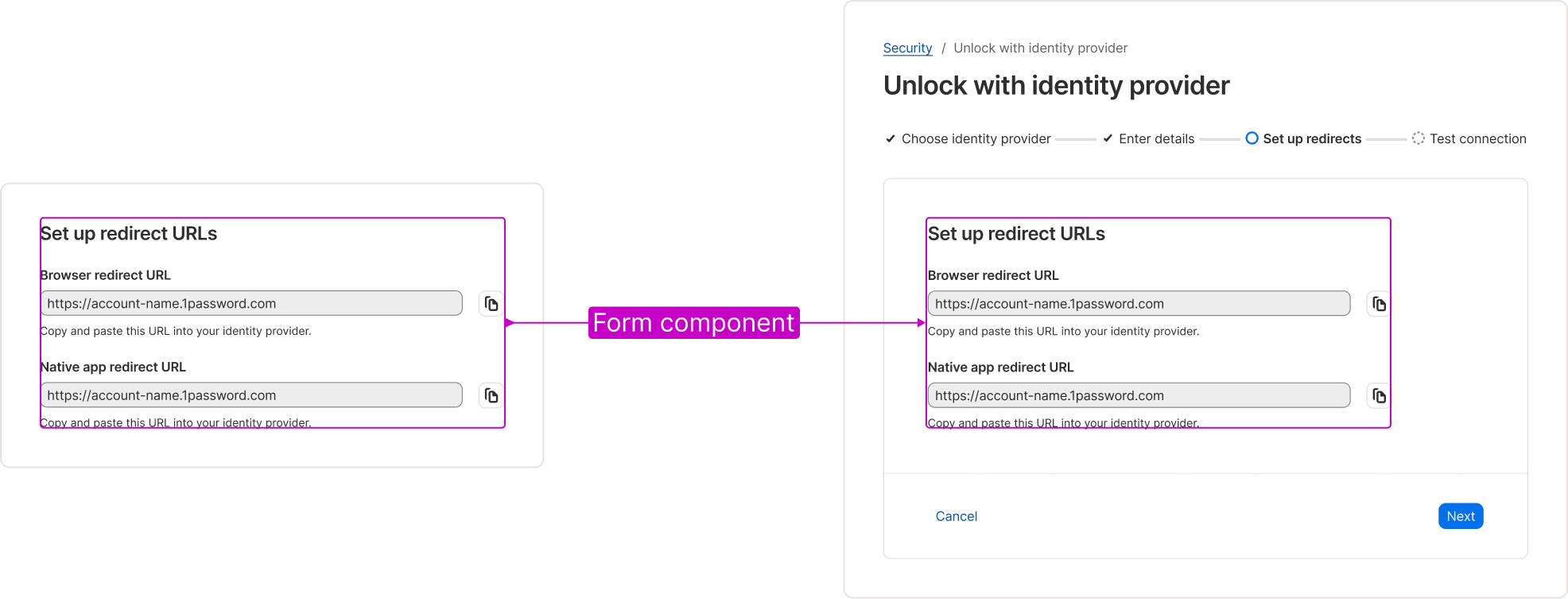
In order to provide a comprehensive wizard guidance to users, I could not rely on the existing, outdated form pattern. Thus, I wrote some content for a new form pattern within the wizard pattern. This included error state, validation, and confirmation guidance. By designing the sprinkles of the form pattern within the wizard pattern systematically, I was able to copy the form guidance over to the form pattern and did not have to rewrite it to work for the form pattern specifically.
Ensuring accessibility at a system level.
Design for a wide audience often means designing for the common denominator, which might not work for every instance. The question here was: “How do we enable flexibility while maintaining consistency”.
For the Wizard, the high-level solution was to provide a default variant, and a custom variant. This also follows the convention of Knox components.
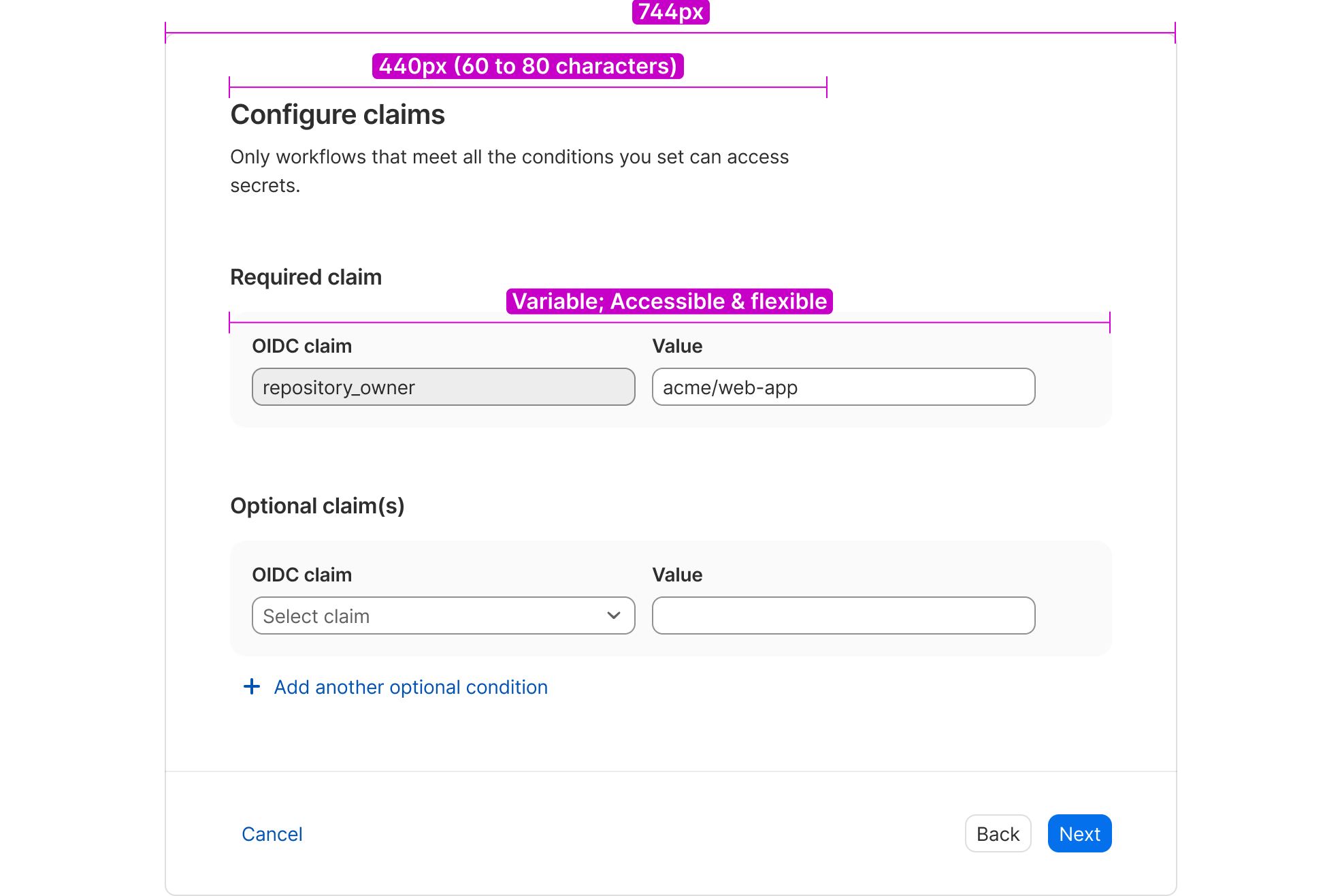
The outer container sizing was relatively easy to determine. We put a box that fit 4 columns of a grid (that I introduced into the Knox design system!) which fit most, if not all, of the content that was already found in our products. Then, I found a number that was divisible by our 8pt baseline unit.
The real difficulty was determining the default of the inner content. We went back on forth between a lot of numbers, but we ended up with a number that was divisible by our 8pt baseline unit and kept to 60–80 characters or glyphs per line for accessibility and readability.
As part of the Form pattern work, I made it so that the form heading and section heading could keep the default sizing for accessibility and readability, while the content could be a variable size, though it was set to the default size upon instance insertion in Figma and in code.
Implementation
As the design component rolled out, I worked with one of our Knox developers to discuss the development side. We determined it was not ideal for Knox to maintain a wizard component since it was so variable, but it was a low lift to update the local wizards so that future developers could copy and paste the styling and logic of the other wizards to speed up the development process.