 Project
:
YADS
Project
YADS
Contribution
Tools & skills
Info+
As an agile software team, quick turnaround and development was key. I identified that one of the major factors slowing us down was the lack of guidelines and reusable design components so the wheel was being reinvented every time. Furthermore, our various products did not follow one design style despite supposedly being part of the same brand, a problem which magnified over the years due to the discrepancy between the team members’ interpretation the non-existent brand style.
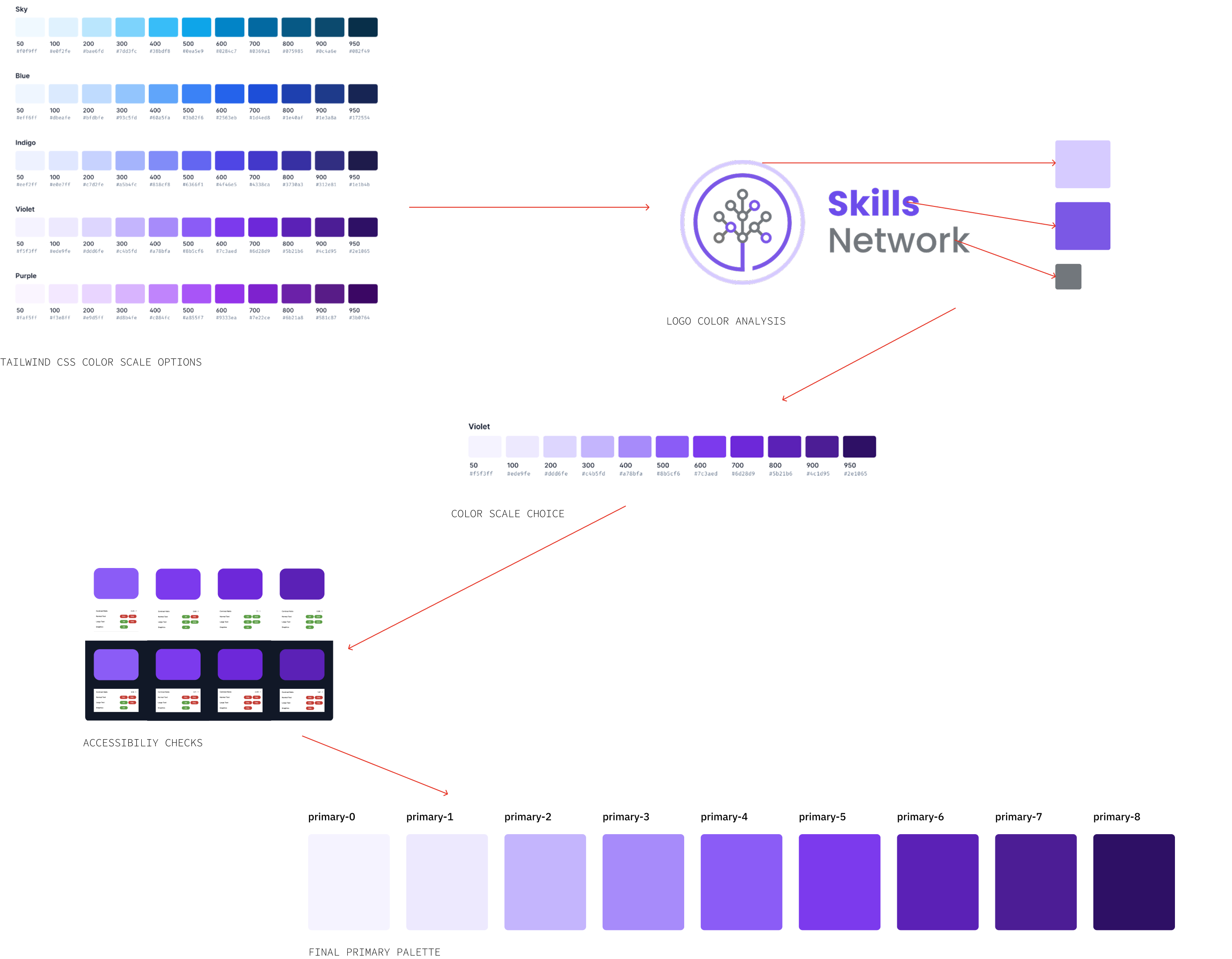
Look how many shades are in the violet/indigo range just on the screen here:
A system had to be created that could bring cohesion to the team’s existing and future products’ visual language, restricting interpretation but still allowing creative freedom. Methodologically, this system needed to enable designers to quickly iterated designs and then hand off to developers for development, with both designers and developers using a system they could reference as a source of truth. Additionally, as the team expands, it is important that the design system remains scalable but cohesive—guardrails must be put in place so that there was still creative freedom despite the restrictions.
Understanding the existing system and processes were key to the successful development integration of YADS, which brings us to the key objectives:
Being a developer-focused team, I also had to cater to both designers and developers in these objectives.
The first part of the process was understanding the existing design style of Skills Network. Once I understood the style, I began to consolidate.
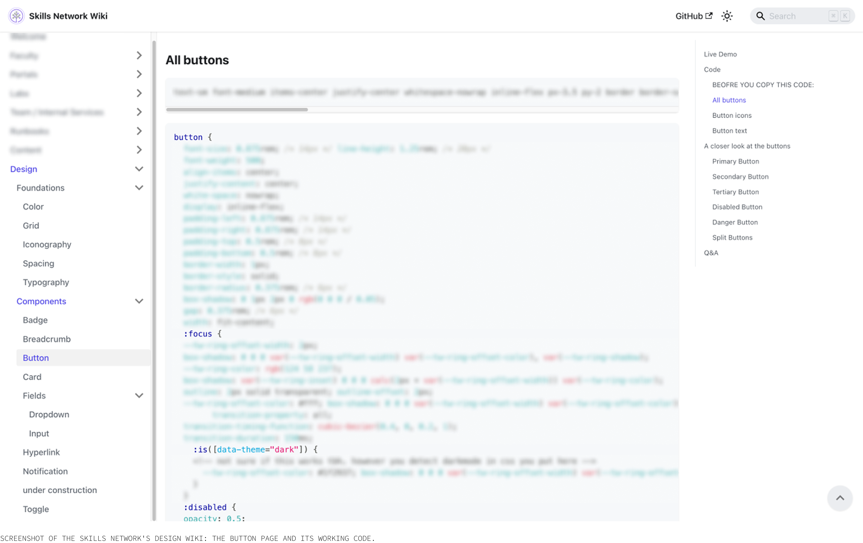
Beyond assessing components based off of visuals, I also referenced the Tailwind CSS code to ensure developers would have access to working code they could easily cross reference with the original Tailwind CSS code. I also included the pure CSS.
Defining the primary, neutral, and semantic colors. A tokening system had yet to be introduced as a standardized system was a new concept for the team. Furthermore, as we were heavily relying on Tailwind CSS, it had yet to make sense for the entire team to migrate to a Skills-Network-specific token system.
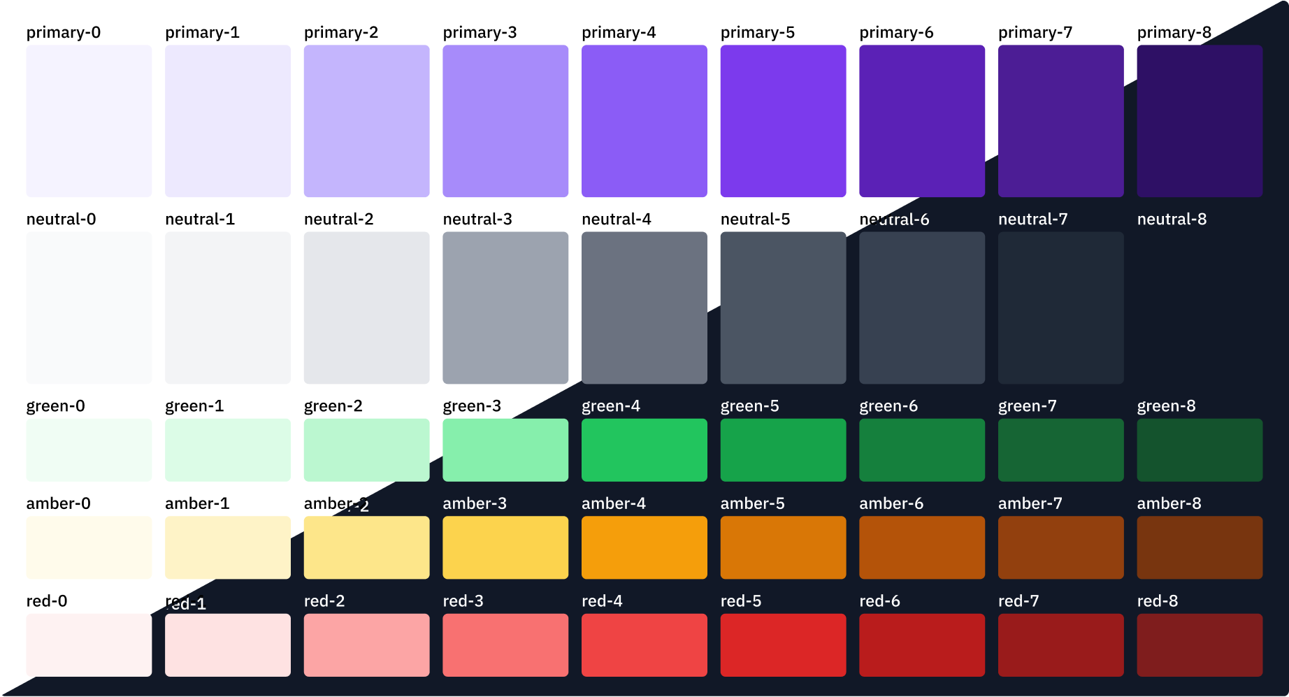

Consolidating the typography system was one of the most difficult challenges due to the huge variance across all the products. The only aspect that was certain was to use IBM Plex Sans, since, you know, it's an IBM team. From a page of 12 fonts with different point sizes, leading, and even color, I was able to reach a point of standardization. In this process, I learned about creating a scalable and adjustable system, which you can read at the end of this case study!
Utilizing a grid was a new concept that I introduced to the team. Rather than relying on max-width, the team could be certain that each page utilized the same amount of space using a grid. Introducing this grid provided visual consistency across all of the pages without having to cross-reference each time a new page was created. The concept of "don't make me think" was signifiacntly utilized in creating this, as I provided all of the code necessary to establish and utilize the grid, as well as written guidance on how to utilize it if one were to think about it.

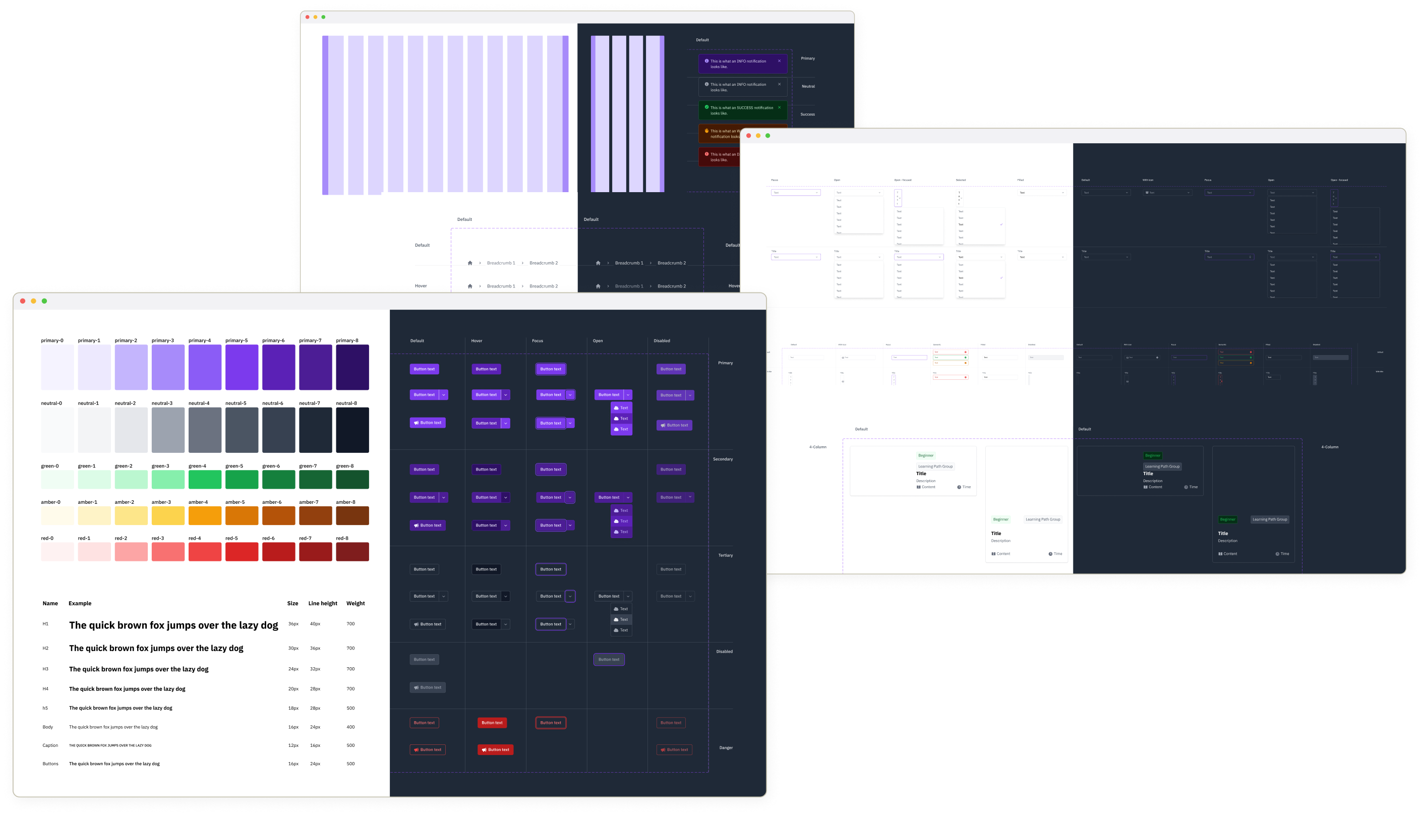
Through my audit of the existing components in our products, I identified key components that had to be standardized. With all design systems, components must be reusable. However, with this team there was an even more important aspect: integration with different programming languages. I was working very closely with developers so I knew the struggles they had with implementation.
So in this process, not only did I audit the visual aspect of these components, I also audited the code that these components were using. In our team's wiki, I outlined the basic HTML structure for each component and where to insert new code if needed (such as an input field for the text field, or a backend response on a button).
Here are just some of the component variants that I created in my time at IBM.
Toggle
Breadcrumb
Button
Card
Text field
Notification
Radio button
Rather than disrupting the existing workflow entirely, YADS would simply provided a better guideline for developers to follow.
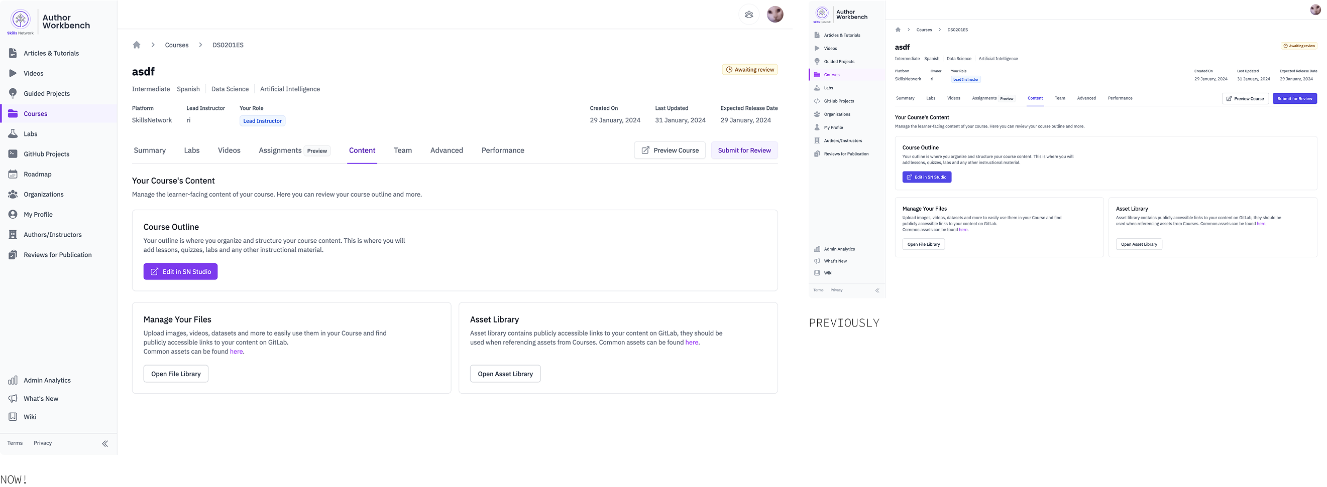
Remember that screen from the beginning? Check out what it looks like now:
When I was nearing what I thought was the end of this consolidation process, I was told by multiple team members that the typography settings were too small. At first, fear took over—What if I made a bad decision that will make the rest of the system seem illegitimate? What if this ruins the designer-developer trust?
Obviously, I was overthinking. An overall bigger font size was implemented and it elevated the friendly aesthetic. But, this made me realize the importance of having a system that can adapt for new scenarios. A rigid design system benefits no one.
But I'm a post-secondary student so it's currently in the works! Thank you for reading so far!